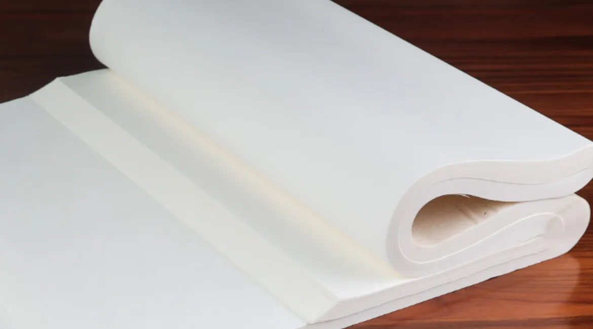
Xuan Paper
In the second post of this series, TOOLS, I gave a brief introduction to traditional xuan paper vs. the gridded ones made specifically for practice. Aside from being larger and lacking reference lines, there’s quite a bit more to writing on the former, including composition, and different ways of working with the paper. Today we will dive into these areas in greater detail.
Traditional Xuan Paper
Traditional xuan paper is usually white, and for calligraphy, the following two sizes are most commonly used: 四尺全開(pronounced as “si chi quan kai”, “chi” is a traditional Chinese unit of measurement, “si” meaning four, and “si chi” equates to roughly 138cm in height. As for “quan kai”, it means the full sheet of paper, which measures about 68cm in width) & 四尺對開 (pronounced as “si chi dui kai”, “si chi” is the same as the former, whereas “dui kai” means in half, therefore the width for this size is 34cm).
Based on how much processing is done, xuan paper can also be divided into the following three categories: (1) 生宣 (pronounced as “sheng xuan”, meaning raw xuan paper) (2) 半熟宣 (pronounced as “ban shou xuan”, meaning half mature xuan paper) (3) 熟宣 (pronounced as “shou xuan”, meaning mature xuan paper). The first category is most absorbent, and the ink tends to spread out further, especially if the ink is thinner. The third is the least absorbent, while the second somewhere in between. The more absorbent paper are better for freer styles such as cursive or grass script, where gradients and visible changes in ink consistency are desired. As for the more meticulous scripts, such as regular script, 熟宣 would be easier to work with. Therefore, when you purchase xuan paper, make sure to note which type it is. And if it’s your first time working on a type of paper, try out different ink consistencies (by adding varying amounts of water to your ink) to get a better feel of the effects.
For most who are starting off, working with such a large, blank piece of paper could be very unwieldy and intimidating. But you needn’t just accept what you’re given! In the video below, I show you how to fold a 四尺對開 xuan paper to create your own reference lines.
** Composition**

The various components of a traditional calligraphy work
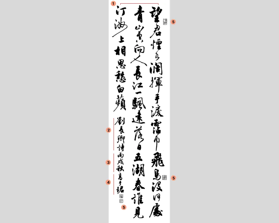
The image above is a traditional 四尺對開 calligraphy work in cursive script that I wrote in 2006 for a competition. I’ve numbered the major components:
(1) is the main content. In this case it’s a 40 word poem written by Tang Dynasty poet Liu Changqing.
(2), (3), (4) combined are what’s called 落款(pronounced as “luo kuan”, meaning signature). (2) indicates that this is a poem by poet Liu Changqing. (3) notes the year (in Chinese Sexagenary cycle) and season, and (4) is my (the calligrapher’s) name. These are the most common components of a signature, and they usually appear in the order shown here.
Lastly, (5) are the stamps — the two under the calligrapher’s name are required. Usually the top one is the stamp of the calligrapher’s name, and the lower one a nickname. Whereas the two on the right are optional; they are usually phrases that represents the calligrapher’s practice or philosophy.
Once you start writing traditional work with the above major components on large sheets of xuan paper, there are more things to consider other than just each individual character. For more rigid scripts such as regular or clerical scripts, it is simpler — you want to make sure each character is aligned with its neighbors, and if there are two of the same characters in close proximity, you’d want to add liveliness to the work by changing up little elements (ex. stroke length or thickness) so that the two characters don’t look exactly the same. Check out this example, where the two 自s are written slightly differently.
It gets more complicated with cursive and grass scripts, where strokes and characters could be linked, and there’s no set size for each character. The higher level goal is to make sure the whole work looks balanced, flows smoothly and is dynamic — and you can achieve this by alternating the size of the words, stroke connections and thickness, the consistency of the ink, brush dryness etc. Some tips include making sure the characters aren’t aligned with their neighbors (yes, the opposite of the more rigid scripts!) and use contrasts liberally (for instance, if the neighbors are bigger, go small; thick, then thin. Revisit my cursive work above to see some of these in practice). This is one of the hardest things to master in calligraphy, and there’s no shortcut — you can only improve by viewing a lot of other people’s work, and experimenting yourself. Rinse and repeat. This is also where one’s own style eventually comes through, as there are infinite possible variations.
Ready to start working on composition? One last tip: even though you’re free to write whatever content you want, a handy way to access a huge corpus of content to practice with, is to use the Tang or Song Dynasty poems. This serves a dual purpose as well if you enjoy learning about ancient Chinese literature — since a lot of these poems were written in calligraphy when they were first created, practicing them in calligraphy gave me a deeper appreciation for the meaning, craft and emotion behind a lot of these literary masterpieces.